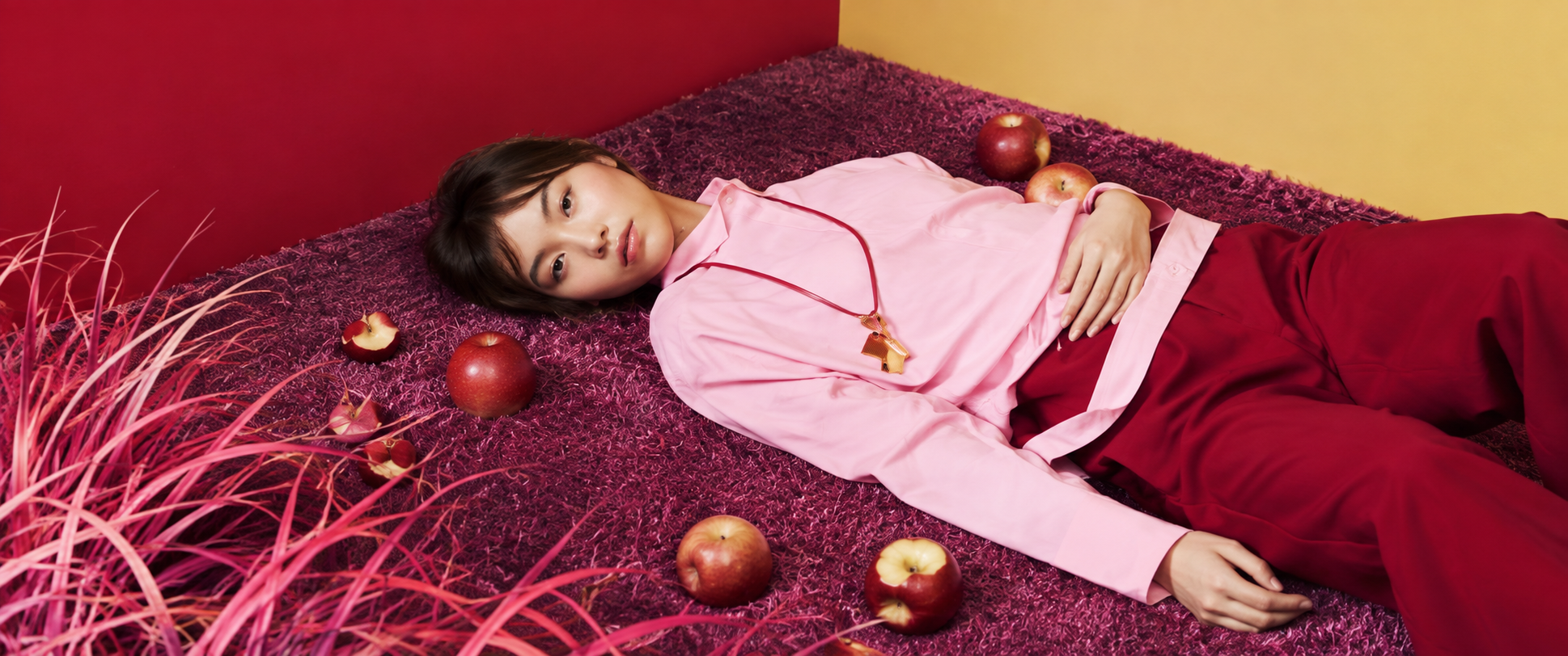
Luxury fashion has always understood the importance of presentation. The clothes matter, of course, but so do the world surrounding them: the photography, typography, colour, layout and atmosphere that shape how a collection is experienced.
That makes luxury fashion websites particularly interesting from a design perspective. They have to do more than display products. They need to communicate the character of the brand while still providing a clear and enjoyable shopping experience.
Some brands achieve this through restraint and minimalism, while others embrace colour, experimentation and strong visual storytelling. There is no single formula for creating a successful fashion website, but the following four brands demonstrate just how different the approach can be.
Acne Studios
Founded in Stockholm in 1996, Acne Studios has developed a distinctive identity that sits somewhere between fashion, art and contemporary culture. The brand’s interests extend beyond clothing into photography, architecture, publishing and design, and this broader creative perspective is reflected in its digital presence.
The Acne Studios website takes a relatively restrained approach to design. Generous white space, straightforward typography and a clean navigation system allow the imagery to take centre stage. Rather than filling every part of the page with information, the design gives the photography room to breathe.
This simplicity is particularly effective for a fashion brand because it allows the products to remain the focus without making the experience feel overly commercial. Campaign photography and product imagery carry much of the visual personality, while the surrounding interface remains deliberately understated.
There is also a sense of confidence in the restraint. Acne Studios does not need to explain every aspect of its identity through the website itself. The combination of photography, typography and carefully considered presentation creates an atmosphere that feels contemporary without becoming overly designed.
Fendi
Fendi offers a very different interpretation of luxury e-commerce. As an Italian fashion house with a long history of craftsmanship and a strong visual identity, its website has more room for theatrical imagery and high-impact campaigns.
The design combines large-scale photography with carefully organised navigation, allowing visitors to move between womenswear, menswear, accessories, jewellery and other categories without losing the sense of the wider brand.
One of the interesting aspects of the Fendi website is the way editorial imagery and commerce sit alongside one another. Campaign photography creates an aspirational atmosphere, while product sections provide a more practical route into shopping.
This balance is important for luxury fashion websites. Customers may arrive because they want to explore a collection or discover a campaign, rather than because they have already decided exactly what they want to buy. The website therefore needs to accommodate both browsing and shopping.
Fendi demonstrates how strong visual storytelling can coexist with a conventional e-commerce structure. The website feels unmistakably like a luxury fashion brand, but the underlying experience remains familiar enough for customers to navigate easily.
Miu Miu
Miu Miu takes a more playful and expressive approach. The brand has long embraced an individual visual language, drawing inspiration from art, cinema, fashion and contemporary culture, and its website reflects that willingness to experiment.
Colour plays an important role in the experience. Rather than relying entirely on neutral backgrounds and traditional luxury styling, the website can use unexpected combinations, bold imagery and distinctive campaign presentations to create a stronger sense of personality.
At the same time, the product pages remain relatively structured. This creates an interesting contrast between the more expressive brand presentation and the practical requirements of an online shop.
That contrast is what makes Miu Miu particularly interesting from a web design perspective. The website does not have to look like a conventional e-commerce store in order to function as one. Strong art direction can give the shopping experience a much more editorial character.
For brands with a distinctive personality, this can be a powerful approach. Rather than separating branding from e-commerce, the shopping experience becomes another way of communicating the brand.
Marni
Marni has built its identity around individuality, unexpected combinations and a willingness to challenge conventional ideas about luxury fashion. Its visual language often combines strong colour, unusual compositions and graphic elements, and these qualities translate naturally into its website.
The Marni example demonstrates how photography can completely change the character of an e-commerce experience. Rather than treating campaign imagery simply as decoration, the website uses it to establish a particular atmosphere around the products.
The result feels more like entering a fashion editorial than browsing a conventional online catalogue. Colour and composition become important parts of the experience, while the relatively simple navigation prevents the visual elements from becoming overwhelming.
This is an important distinction. A visually expressive website does not necessarily need a complicated interface. In fact, keeping the navigation and underlying structure relatively simple can give creative content more impact.
Marni shows how a strong visual identity can be translated into digital design without losing usability.
What these four websites have in common
Acne Studios, Fendi, Miu Miu and Marni have very different identities, but their websites share an important principle: the digital experience reflects the brand rather than treating the website as a separate piece of communication.
Acne Studios uses restraint and simplicity. Fendi combines luxury imagery with a more traditional e-commerce structure. Miu Miu brings colour and experimentation into the shopping experience, while Marni uses art direction and unexpected visual combinations to create a distinctive atmosphere.
None of these approaches is inherently better than the others. What matters is that the design feels appropriate to the brand.
That is perhaps the most useful lesson for any e-commerce business. A successful website does not have to follow a particular visual trend or copy the conventions of other online stores. The design should start with an understanding of the brand and then use technology, layout and user experience to communicate that identity clearly.
The best fashion websites make this feel effortless. You can browse products, find what you are looking for and make a purchase, but you are also experiencing the world the brand has created.
That is what separates a beautifully designed e-commerce website from a simple online catalogue.
Leave a Reply